
Web Components: Hướng Dẫn Hoàn Chỉnh Từ Custom Elements Đến Shadow DOM
Học Web Components từ A-Z: Custom Elements, Shadow DOM, template & slot, lifecycle callbacks, attributeChangedCallback, ::part, ElementInternals, declarative shadow DOM, SSR và cách dùng chung với React, Vue hay Astro.
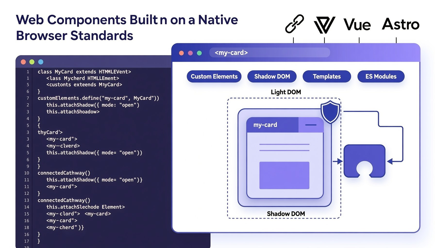
Bạn đã bao giờ copy một đoạn component từ project này sang project khác, rồi phát hiện nó phụ thuộc vào ba thư viện khác, một build config riêng và một global CSS mà bạn không dám xoá? Hoặc bạn muốn viết một widget nhỏ để nhúng vào website của khách hàng, nhưng không thể bắt khách hàng cài React?
Đó chính là bài toán mà Web Components sinh ra để giải quyết.
Web Components không phải một framework mới. Nó là một bộ chuẩn của nền tảng web — nghĩa là trình duyệt hiểu nó trực tiếp, không cần build step, không cần runtime, và một component viết ra có thể chạy trong HTML thuần, React, Vue, Angular hay Astro.
Trong bài viết này, chúng ta sẽ đi từ bốn trụ cột của Web Components, viết một component thực tế từ đầu, rồi đi tới những phần ít người dạy nhưng cực kỳ quan trọng khi làm sản phẩm thật: ::part, ElementInternals, Declarative Shadow DOM, SSR và cách phối hợp với các framework.
Web Components là gì?
Web Components là một tập hợp các tiêu chuẩn W3C/WHATWG cho phép bạn tạo ra thẻ HTML của riêng mình với hành vi và giao diện được đóng gói hoàn toàn.
Nó gồm bốn phần, thường được gọi là “bốn trụ cột”:
| Trụ cột | Vai trò |
|---|---|
| Custom Elements | Định nghĩa thẻ HTML mới (<my-card>) và vòng đời của nó |
| Shadow DOM | Cô lập DOM và CSS — “DOM con” riêng, không rò rỉ ra ngoài |
| HTML Templates | <template> và <slot> để khai báo markup và cho phép tuỳ biến |
| ES Modules | Đóng gói, import/export và phân phối component như mọi module JS |
Điểm mấu chốt cần hiểu ngay từ đầu:
Framework là thư viện chạy trong trang. Web Components là phần của trang. Đó là lý do một Web Component không cần ai “host” nó.
Web Components so với framework
Hãy so sánh thẳng thắn để bạn biết khi nào nên chọn gì:
| Tiêu chí | Web Components | React / Vue / Svelte |
|---|---|---|
| Runtime | Không có (chuẩn trình duyệt) | Có (vài chục KB+) |
| Đóng gói CSS | ✅ Tự nhiên nhờ Shadow DOM | ⚠️ Cần CSS-in-JS, scoped CSS, hoặc thủ công |
| Dùng trong app khác framework | ✅ Chỉ cần một thẻ HTML | ⚠️ Cần mount, adapter, hoặc iframe |
| Trải nghiệm phát triển | ⚠️ Verbose, phải tự lo reactivity | ✅ JSX/SFC, reactive, devtools tốt |
| Hệ sinh thái / thư viện | Nhỏ hơn | Rất lớn |
| Hợp SSR | ⚠️ Cần Declarative Shadow DOM | ✅ Framework có tooling sẵn |
Kết luận thực dụng: Web Components mạnh ở lớp “phân phối và cô lập”, framework mạnh ở lớp “tổ chức ứng dụng”. Nhiều công ty dùng design system viết bằng Web Components rồi tiêu thụ nó từ React, Vue và cả trang marketing tĩnh.
Hỗ trợ trình duyệt
Tin tốt: bạn không cần polyfill nữa. Custom Elements v1 và Shadow DOM v1 hiện có mặt ở Chrome 54+, Firefox 63+, Safari 10.1+, Edge 79+ — tương đương hơn 98% người dùng toàn cầu. Riêng vài tính năng mới hơn có mốc thấp hơn:
- Declarative Shadow DOM: Chrome 111+, Safari 16.4+, Firefox 123+
- Form-associated custom elements (
ElementInternals): Chrome 77+, Firefox 93+, Safari 16.4+ adoptedStyleSheets: Chrome 73+, Firefox 101+, Safari 16.4+- Customized built-in elements (
<button is="my-button">): Safari không hỗ trợ — hãy tránh nếu cần đa nền tảng
Trụ cột 1 — Custom Elements
Custom Element là một class JavaScript kế thừa HTMLElement, được đăng ký với trình duyệt bằng customElements.define().
Hai quy tắc bắt buộc khi đặt tên:
- Tên phải có dấu gạch ngang (
my-card✅,mycard❌) — để không bao giờ trùng với thẻ HTML tương lai. - Phải là chữ thường, không có ký tự đặc biệt hay chữ in hoa.
Component đầu tiên
class HelloWorld extends HTMLElement {
  connectedCallback() {
    this.innerHTML = '<p>Xin chào từ Web Component! </p>';
  }
}

customElements.define('hello-world', HelloWorld);
<!-- Dùng ở bất kỳ đâu, kể cả trong React hay Vue -->
<hello-world></hello-world>
Đó là toàn bộ “hello world”. Không cần import runtime, không cần build.
Vòng đời (lifecycle callbacks)
Đây là phần quan trọng nhất của Custom Elements — nó thay thế cho useEffect/onMounted mà bạn quen dùng:
class MyCard extends HTMLElement {
  // 1. Chạy khi element được tạo (kể cả do document.createElement)
  //    ⚠️ Chưa có attribute con, chưa nằm trong DOM
  constructor() {
    super();
    this._title = '';
  }

  // 2. Chạy khi element được chèn vào DOM (có thể nhiều lần nếu bị di chuyển)
  connectedCallback() {
    this.render();
    this.addEventListener('click', this._onClick);
  }

  // 3. Chạy khi element bị xoá khỏi DOM — nơi dọn dẹp
  disconnectedCallback() {
    this.removeEventListener('click', this._onClick);
    clearInterval(this._timer);
  }

  // 4. Chạy khi attribute trong observedAttributes thay đổi
  attributeChangedCallback(name, oldValue, newValue) {
    if (oldValue === newValue) return; // tránh render thừa
    this.render();
  }

  // 5. Chạy khi element được di chuyển sang document khác (iframe, popup)
  adoptedCallback() {
    // hiếm khi dùng
  }

  _onClick = () => {
    this.dispatchEvent(new CustomEvent('card-click', { bubbles: true, composed: true }));
  };
}
Một vài điều cần ghi nhớ về vòng đời:
constructorkhông được đọc attribute hay chèn con. Khi constructor chạy, element chưa có ngữ cảnh DOM. Trình duyệt sẽ cảnh báo nếu bạn set attribute trong đó. Chỉ nênsuper(), khởi tạo state vàattachShadow.connectedCallbackcó thể chạy nhiều lần. Nếu ai đóappendChildelement sang chỗ khác,disconnectedCallbackrồiconnectedCallbacksẽ chạy lại. Đừng giả định nó chỉ chạy một lần.- Element tồn tại trước khi được define. Nếu bạn viết
<my-card>trong HTML rồi mới load script, trình duyệt sẽ nâng cấp (upgrade) element khidefine()chạy — và khi đóconstructor+attributeChangedCallback(cho mọi attribute có sẵn) sẽ chạy ngay.
Attribute, property và reflection
Đây là chỗ dễ gây bug nhất khi mới học Custom Elements. Cần phân biệt rõ:
- Attribute nằm trong HTML, luôn là chuỗi:
<my-card title="Xin chào"> - Property nằm trên object DOM, giữ mọi kiểu dữ liệu:
card.settings = { theme: 'dark' }
Mẫu code “reflect” chuẩn nên viết như sau:
class MyCard extends HTMLElement {
  // Khai báo những attribute cần theo dõi
  static observedAttributes = ['title', 'count'];

  // Getter/setter cho kiểu dữ liệu phong phú — không map được vào attribute
  set settings(value) {
    this._settings = value;
    this.render();
  }
  get settings() {
    return this._settings;
  }

  // Boolean attribute: sự tồn tại mới là true, không phải giá trị
  get disabled() {
    return this.hasAttribute('disabled');
  }
  set disabled(value) {
    this.toggleAttribute('disabled', Boolean(value));
  }

  attributeChangedCallback(name, oldValue, newValue) {
    if (oldValue === newValue) return;

    if (name === 'count') {
      // Attribute là chuỗi → phải parse
      this._count = Number(newValue ?? 0);
    }
    this.render();
  }
}
Quy tắc vàng để quyết định:
| Dữ liệu | Nên truyền qua |
|---|---|
| Chuỗi đơn giản, có thể xuất hiện trong HTML/SSR | Attribute |
| Boolean | Attribute (dùng hasAttribute/toggleAttribute) |
| Object, array, function, instance | Property |
| Dữ liệu lớn hoặc thay đổi thường xuyên | Property |
Trụ cột 2 — Shadow DOM
Shadow DOM là tính năng khiến Web Components khác biệt so với mọi cách làm component trước đó. Nó cho element của bạn một cây DOM riêng, biệt lập:
class MyCard extends HTMLElement {
  constructor() {
    super();
    // Tạo shadow root — nên làm trong constructor
    const shadow = this.attachShadow({ mode: 'open' });

    shadow.innerHTML = `
      <style>
        :host { display: block; }
        .card {
          border: 1px solid #e5e7eb;
          border-radius: 12px;
          padding: 16px;
          font-family: system-ui, sans-serif;
        }
      </style>
      <div class="card" part="card">
        <slot name="title"></slot>
        <slot></slot>
      </div>
    `;
  }
}
customElements.define('my-card', MyCard);
Lợi ích cụ thể của Shadow DOM:
- CSS không rò rỉ.
.card { color: red }trong trang sẽ không ảnh hưởng.cardbên trong shadow root, và ngược lại. Bạn hết cảnh component bị global CSS của “ai đó” phá. - Selector không đụng nhau. Bạn có thể đặt tên class ngắn gọn (
.card,.title) mà không sợ trùng. - DOM API không thấy xuyên qua.
document.querySelector('.card')không tìm được vào shadow root — tốt cho cả đóng gói lẫn việc script lạ khó can thiệp.
mode: 'open' cho phép truy cập qua element.shadowRoot (cần thiết cho testing và debugging). mode: 'closed' ẩn hoàn toàn — nhưng đừng xem nó là bảo mật, vì ai cũng có thể vượt qua bằng Element.prototype.attachShadow bị patch. Hãy dùng open cho hầu hết trường hợp.
Styling xuyên ranh giới: 3 công cụ bạn cần
Ranh giới style là điểm mạnh, nhưng bạn cần “cửa mở” để theme được. Có chính xác ba cách:
1. CSS custom properties — cách theming chính (kế thừa được luôn)
/* Bên ngoài */
my-card {
  --card-bg: #1e293b;
  --card-radius: 16px;
}
/* Bên trong shadow root */
shadow.innerHTML = `
  <style>
    .card {
      background: var(--card-bg, white);
      border-radius: var(--card-radius, 12px);
    }
  </style>
`;
Custom properties là thứ duy nhất kế thừa xuyên qua shadow boundary theo cách bạn mong đợi. Đây là lý do design system hiện đại (Shoelace, FAST, Spectrum) đều dùng CSS variables làm API theming.
2. part và ::part() — cho phép chọn phần tử bên trong
<!-- Bên trong shadow root -->
<button part="button primary">Lưu</button>
/* Bên ngoài style trực tiếp */
my-card::part(button) {
  font-weight: 600;
  padding: 10px 20px;
}
my-card::part(button primary) { background: #2563eb; color: white; }
::part() chỉ style được chính phần tử có part (không đi sâu xuống con của nó), và không thể tạo ra layout phá vỡ thiết kế — một lựa chọn API khá khéo léo.
3. ::slotted() — style nội dung do người dùng truyền vào
/* Chỉ tác động lên con trực tiếp được đưa vào slot */
::slotted(h2) {
  margin: 0 0 8px;
  color: #111827;
}
::slotted(strong) { color: #2563eb; }
Các selector đặc biệt cần nhớ
/* Style chính bản thân element */
:host { display: block; padding: 8px; }

/* Chỉ khi element khớp điều kiện */
:host([disabled]) { opacity: 0.5; pointer-events: none; }
:host(.featured) { border-color: gold; }

/* Theo ngữ cảnh cha (lưu ý: Firefox chưa hỗ trợ) */
:host-context(.dark-theme) { background: #0f172a; color: white; }
FOUC và :defined
Nếu component tải bằng JS, người dùng có thể thấy nội dung “thô” trước khi element được nâng cấp. Dùng :defined để xử lý:
/* Ẩn cho tới khi component sẵn sàng */
my-card:not(:defined) {
  display: block;
  min-height: 120px;
  background: linear-gradient(90deg, #f1f5f9 25%, #e2e8f0 50%, #f1f5f9 75%);
  background-size: 200% 100%;
  animation: shimmer 1.2s infinite;
  border-radius: 12px;
}
@keyframes shimmer {
  0% { background-position: 200% 0; }
  100% { background-position: -200% 0; }
}
Đây là “skeleton loading” chỉ bằng CSS, không tốn một dòng JavaScript — và giúp chống layout shift (CLS) rất tốt.
Trụ cột 3 — Template và Slot
<template>
<template> chứa markup không được render cho tới khi bạn clone nó. Nội dung bên trong template không tải ảnh, không chạy script, không ảnh hưởng layout — hoàn hảo để làm khuôn mẫu.
<template id="card-template">
  <style>
    :host { display: block; font-family: system-ui, sans-serif; }
    .wrap { border: 1px solid #e5e7eb; border-radius: 12px; padding: 16px; }
  </style>
  <div class="wrap" part="card">
    <header class="head" part="header">
      <slot name="title">Tiêu đề mặc định</slot>
    </header>
    <div class="body" part="body"><slot></slot></div>
  </div>
</template>

<script>
class MyCard extends HTMLElement {
  constructor() {
    super();
    const shadow = this.attachShadow({ mode: 'open' });
    // cloneNode(true) — luôn dùng true để copy cả cây con
    shadow.append(document.getElementById('card-template').content.cloneNode(true));
  }
}
customElements.define('my-card', MyCard);
</script>
Lưu ý: khi dùng template.cloneNode(true), hai instance sẽ dùng chung stylesheet đó trong markup. Nếu bạn cần nhiều instance và muốn tối ưu, hãy chuyển sang adoptedStyleSheets (xem phần Hiệu năng) — trình duyệt sẽ chia sẻ một object CSS giữa mọi instance thay vì parse lại.
<slot> — cho phép người dùng tuỳ biến nội dung
Slot là “lỗ cắm” để bạn truyền nội dung vào từ bên ngoài, giống children trong React:
<my-card>
  <h2 slot="title">Doanh số Q3</h2>
  <p>Doanh số tăng <strong>24%</strong> so với quý trước.</p>
</my-card>
Hai loại slot:
- Default slot —
<slot></slot>nhận mọi nội dung không có thuộc tínhslot - Named slot —
<slot name="title">nhận nội dung có<... slot="title"> - Nội dung giữa
<slot>chính là fallback khi không ai truyền gì vào.
Và đây là phần ít người biết: bạn có thể truy vấn ngược nội dung đã được cắm vào:
class MyTabs extends HTMLElement {
  connectedCallback() {
    this.shadowRoot.querySelector('slot')
      .addEventListener('slotchange', (e) => {
        // assignedElements() chỉ trả về element, bỏ qua text node
        const tabs = e.target.assignedElements();
        console.log(`Có ${tabs.length} tab được truyền vào`);
        tabs.forEach(tab => tab.setAttribute('role', 'tab'));
      });
  }
}
Đây là kỹ thuật nền tảng để làm tabs, accordion, carousel — nơi component cần đọc hiểu nội dung mà người dùng truyền vào.
Component thực tế: <copy-button>
Hãy ghép mọi thứ lại thành một component bạn dùng được ngay trong blog hoặc docs — nút “Copy” cho code block:
class CopyButton extends HTMLElement {
  static observedAttributes = ['value', 'label'];

  constructor() {
    super();
    this.attachShadow({ mode: 'open' });
    this._resetTimer = null;
  }

  connectedCallback() {
    this.render();
    this.shadowRoot.querySelector('button')
      .addEventListener('click', this._copy);
  }

  disconnectedCallback() {
    clearTimeout(this._resetTimer);
  }

  attributeChangedCallback(name, oldValue, newValue) {
    if (oldValue !== newValue && this.shadowRoot) this.render();
  }

  get value() {
    return this.getAttribute('value') ?? '';
  }
  set value(v) {
    this.setAttribute('value', v);
  }

  _copy = async () => {
    const text = this.value;
    if (!text) return;

    try {
      await navigator.clipboard.writeText(text);
    } catch {
      // Fallback cho môi trường không có clipboard API (http, iframe hạn chế)
      const ta = document.createElement('textarea');
      ta.value = text;
      ta.style.position = 'fixed';
      ta.style.opacity = '0';
      document.body.appendChild(ta);
      ta.select();
      document.execCommand('copy');
      ta.remove();
    }

    this._feedback('Đã copy!');
    this.dispatchEvent(new CustomEvent('copied', {
      detail: { text },
      bubbles: true,
      composed: true, // cần thiết để event thoát khỏi shadow DOM
    }));
  };

  _feedback(message) {
    const btn = this.shadowRoot.querySelector('button');
    btn.textContent = message;
    btn.classList.add('done');
    clearTimeout(this._resetTimer);
    this._resetTimer = setTimeout(() => this.render(), 1500);
  }

  render() {
    const label = this.getAttribute('label') || 'Copy';
    this.shadowRoot.innerHTML = `
      <style>
        :host { display: inline-block; }
        button {
          font: inherit;
          font-size: 13px;
          padding: 6px 12px;
          border: 1px solid var(--copy-border, #d1d5db);
          background: var(--copy-bg, #ffffff);
          color: var(--copy-color, #111827);
          border-radius: 8px;
          cursor: pointer;
          transition: background-color .15s ease, transform .15s ease;
        }
        button:hover { background: var(--copy-hover-bg, #f3f4f6); }
        button:active { transform: scale(.97); }
        button.done { background: #dcfce7; border-color: #86efac; color: #166534; }
        button:focus-visible { outline: 2px solid #2563eb; outline-offset: 2px; }
      </style>
      <button type="button" part="button" aria-live="polite">${label}</button>
    `;
  }
}

customElements.define('copy-button', CopyButton);
Và dùng nó thế này:
<copy-button value="npx astro build" label="Copy lệnh"></copy-button>

<!-- Theme từ bên ngoài bằng CSS variables -->
<style>
  copy-button {
    --copy-bg: #1e293b;
    --copy-color: white;
    --copy-border: #334155;
  }
</style>

<!-- Hoặc style sâu vào bên trong bằng ::part -->
<style>
  copy-button::part(button) {
    text-transform: uppercase;
    letter-spacing: .04em;
  }
</style>
Component này đã có: đóng gói CSS, fallback clipboard, phản hồi trực quan, sự kiện tuỳ biến, và API theming qua hai cơ chế. Đó là hình mẫu tốt cho mọi Web Component bạn viết.
Sự kiện: composed là chìa khoá
Đây là lỗi phổ biến nhất khi lần đầu làm việc với Shadow DOM: bạn dispatch event trong component nhưng bên ngoài không nghe thấy gì.
Lý do: event mặc định không đi xuyên qua shadow boundary. Ba thuộc tính của CustomEvent bạn cần nắm:
this.dispatchEvent(new CustomEvent('value-change', {
  detail: { value: 42 },  // 1. Dữ liệu kèm theo — nhận qua e.detail
  bubbles: true,          // 2. Bong bóng lên cây DOM cha
  composed: true,         // 3. ✅ Đi xuyên qua shadow boundary
}));

// Parent bên ngoài shadow DOM vẫn nghe được
document.querySelector('my-slider')
  .addEventListener('value-change', (e) => console.log(e.detail.value));
Quy tắc: hầu như luôn set bubbles: true, composed: true cho custom event. Chỉ để false khi bạn muốn event riêng tư, nội bộ trong component.
Một lưu ý về detail: chỉ truyền dữ liệu đơn giản, đừng truyền tham chiếu tới DOM node nội bộ — cần thì truyền this (chính element) để bên ngoài tự truy vấn.
Nâng cao: Declarative Shadow DOM và SSR
Vấn đề lớn nhất của Web Components gốc là SSR. Nếu shadow root chỉ được tạo trong JavaScript, thì máy tìm kiếm, curl hay người dùng tắt JS đều thấy trang trống.
Declarative Shadow DOM (DSD) giải quyết đúng bài toán đó: khai báo shadow root ngay trong HTML.
<my-card>
  <template shadowrootmode="open">
    <style>
      :host { display: block; }
      .wrap { border: 1px solid #e5e7eb; border-radius: 12px; padding: 16px; }
    </style>
    <div class="wrap" part="card">
      <slot name="title">Tiêu đề</slot>
    </div>
  </template>

  <h2 slot="title">Doanh số Q3</h2>
</my-card>
Trình duyệt gặp <template shadowrootmode="open"> sẽ gắn shadow root ngay khi parse HTML — không cần đợi JavaScript. Nội dung đã có sẵn trong DOM nên:
- Crawler và công cụ đọc màn hình đọc được nội dung ✅
- Không có layout shift vì nội dung đã hiển thị ✅
- Không có FOUC ✅
- JavaScript chỉ còn nhiệm vụ “hydration” — gắn event listener khi element được nâng cấp ✅
Nếu bạn viết trong JS, attachShadow phải chấp nhận element đã có shadow root sẵn:
class MyCard extends HTMLElement {
  connectedCallback() {
    // Nếu DSD đã tạo shadow root (mode open), đừng attach lại
    if (!this.shadowRoot) {
      this.attachShadow({ mode: 'open' })
        .append(document.getElementById('card-template').content.cloneNode(true));
    }
    // Ở đây chỉ gắn behavior lên markup đã có
    this.shadowRoot.querySelector('button')?.addEventListener('click', this._onClick);
  }
}
Trong Astro, bạn có thể render DSD trực tiếp trong một .astro component — đây là cách Devs2.org dùng cho các widget cần SSR tốt. Với các framework khác, thư viện như @lit-labs/ssr có thể render ra DSD tự động.
Form, validation và accessibility với ElementInternals
Trước đây, một custom input không thể tham gia <form>: new FormData(form) không thấy nó, <label for> không trỏ được, validation API bỏ qua nó. ElementInternals sửa tất cả.
class StarRating extends HTMLElement {
  static formAssociated = true;           // 1. Đăng ký là form control
  static observedAttributes = ['name', 'value'];

  constructor() {
    super();
    this._internals = this.attachInternals(); // 2. Lấy "cửa" vào form
    this.attachShadow({ mode: 'open' });
  }

  connectedCallback() { this.render(); }

  attributeChangedCallback() { if (this.shadowRoot) this.render(); }

  get value() { return Number(this.getAttribute('value') || 0); }

  set value(v) {
    this.setAttribute('value', String(v));
    // 3. Đẩy giá trị vào form — xuất hiện trong FormData và form.reset()
    this._internals.setFormValue(String(v));

    // 4. Báo lỗi validation tuỳ chỉnh
    if (Number(v) === 0) {
      this._internals.setValidity(
        { customError: true },
        'Vui lòng chọn ít nhất 1 sao'
      );
    } else {
      this._internals.setValidity({});
    }
  }

  formResetCallback() { this.value = '0'; }   // 5. Hook đặc biệt cho form.reset()

  render() {
    const v = this.value;
    this.shadowRoot.innerHTML = `
      <style>
        :host { display: inline-flex; gap: 4px; }
        button { all: unset; cursor: pointer; font-size: 24px; line-height: 1; }
        button[aria-checked="true"] { color: #f59e0b; }
        button[aria-checked="false"] { color: #d1d5db; }
        button:focus-visible { outline: 2px solid #2563eb; border-radius: 4px; }
      </style>
      ${[1, 2, 3, 4, 5].map(n => `
        <button type="button" role="radio"
                aria-checked="${n <= v}"
                aria-label="${n} sao"
                data-value="${n}">
          ${n <= v ? '★' : '☆'}
        </button>
      `).join('')}
    `;

    this.shadowRoot.querySelectorAll('button').forEach(btn => {
      btn.addEventListener('click', () => { this.value = btn.dataset.value; });
    });

    // 6. Truyền thông tin a11y cho screen reader đi qua shadow boundary
    this._internals.role = 'radiogroup';
    this._internals.ariaLabel = 'Đánh giá sao';
  }
}

customElements.define('star-rating', StarRating);
<form id="review">
  <label for="rating">Đánh giá của bạn</label>
  <star-rating id="rating" name="rating" value="0"></star-rating>
  <button type="submit">Gửi</button>
</form>

<script>
  const form = document.getElementById('review');
  form.addEventListener('submit', (e) => {
    e.preventDefault();
    // ✅ Custom element xuất hiện trong FormData như input thường
    console.log([...new FormData(form)]); // [['rating', '4']]
  });
  console.log(form.checkValidity()); // false nếu chưa chọn sao
</script>
ElementInternals cũng là công cụ chính để làm accessibility cho Web Components: internals.role, internals.ariaLabel, internals.ariaChecked, internals.labels… vì ARIA attribute đặt trong shadow DOM không được screen reader đọc từ element host.
Hiệu năng: 5 tối ưu quan trọng
Web Components rất nhẹ, nhưng có vài cái bẫy hiệu năng bạn nên biết trước khi lên production.
1. Dùng adoptedStyleSheets thay vì chèn <style> mỗi instance
Cách ngây thơ — mỗi instance parse lại CSS — sẽ tạo ra hàng nghìn stylesheet nếu bạn render nhiều row trong bảng:
// ❌ Mỗi instance tạo CSSStyleSheet mới → tốn bộ nhớ, parse lặp lại
this.shadowRoot.innerHTML = `<style>...</style><div>...</div>`;
Cách tối ưu: tạo một CSSStyleSheet ở module scope, chia sẻ cho tất cả:
// ✅ Một stylesheet, mọi instance dùng chung — parse chỉ 1 lần
const sheet = new CSSStyleSheet();
sheet.replaceSync(`
  :host { display: block; }
  .row { display: flex; gap: 12px; padding: 8px 12px; border-bottom: 1px solid #f1f5f9; }
  .row:hover { background: #f8fafc; }
`);

class DataRow extends HTMLElement {
  constructor() {
    super();
    const shadow = this.attachShadow({ mode: 'open' });
    shadow.adoptedStyleSheets = [sheet]; // chia sẻ reference, không copy
    shadow.innerHTML = '<div class="row"><slot></slot></div>';
  }
}
Đây là tối ưu lớn nhất và dễ làm nhất trong danh sách này.
2. Không render trong attributeChangedCallback một cách mù quáng
Mỗi setAttribute đều kích hoạt callback. Nếu ai đó set 5 attribute trong một loop, bạn sẽ render 5 lần. Hãy dùng cờ và gộp vào microtask:
_scheduleRender() {
  if (this._renderQueued) return;
  this._renderQueued = true;
  queueMicrotask(() => {
    this._renderQueued = false;
    this.render();
  });
}
3. Lazy define cho component nặng
Nếu một component kéo theo thư viện lớn (chart, editor), đừng import nó ngay từ đầu:
class LazyChart extends HTMLElement {
  async connectedCallback() {
    this.innerHTML = '<p>Đang tải biểu đồ…</p>';
    // Chỉ tải chunk code khi component thực sự xuất hiện
    const { renderChart } = await import('./chart-renderer.js');
    renderChart(this, this._data);
  }
}
customElements.define('lazy-chart', LazyChart);
Kết hợp với Intersection Observer để chỉ tải khi người dùng cuộn tới, và bạn có code splitting thật sự không cần bundler phức tạp.
4. Giữ :host có display
Mặc định Custom Element là display: inline — nguyên nhân của vô số bug layout khó hiểu (“sao nó không có chiều cao?”). Luôn khai báo:
:host { display: block; } /* hoặc inline-block / flex / grid */
5. Tránh innerHTML trong constructor
innerHTML trên shadow root trong constructor buộc trình duyệt parse HTML ở thời điểm chưa cần thiết. connectedCallback là nơi thích hợp hơn — trừ khi bạn dùng <template> đã có sẵn trong document (parse sẵn, clone rẻ).
Dùng Web Components trong React, Vue và Astro
Đây là câu hỏi thực tế nhất: component của tôi dùng được trong app đang chạy framework không?
React 19+
React 19 hỗ trợ Custom Elements đúng cách: truyền được object/array qua property, và gắn được custom event bằng cú pháp on*. Trước đây (React ≤ 18) React chỉ set attribute — nên object bị ép thành "[object Object]".
import 'my-components/star-rating'; // đăng ký element

export function Review() {
  const [rating, setRating] = useState(0);

  return (
    <star-rating
      name="rating"
      value={rating}
      onValueChange={(e: CustomEvent) => setRating(e.detail.value)}
    />
  );
}
Với React 18 trở về trước, cần một wrapper nhỏ dùng ref để gán property:
function StarRating({ value, onChange }) {
  const ref = useRef(null);

  useEffect(() => {
    const el = ref.current;
    if (!el) return;
    el.value = value;                        // gán property, không phải attribute
    const handler = (e) => onChange(e.detail.value);
    el.addEventListener('value-change', handler);
    return () => el.removeEventListener('value-change', handler);
  }, [value, onChange]);

  return <star-rating ref={ref} />;
}
Vue 3
Vue cần cấu hình để hiểu các thẻ có gạch ngang là custom element:
// vite.config.js
import vue from '@vitejs/plugin-vue';

export default {
  plugins: [
    vue({
      template: {
        compilerOptions: {
          // Coi mọi thẻ chứa '-' là custom element → không cảnh báo
          isCustomElement: (tag) => tag.includes('-'),
        },
      },
    }),
  ],
};
Với Vue, v-bind trên custom element đã tự động ưu tiên property khi cần, và @value-change hoạt động với custom event.
Astro
Astro là môi trường lý tưởng cho Web Components vì nó không “chiếm” cây DOM:
---
// Component Astro render markup sẵn, rồi Web Component chỉ hydration
const items = ['Doanh thu', 'Chi phí', 'Lợi nhuận'];
---
<div class="grid">
  {items.map(item => (
    <data-row>
      <span slot="label">{item}</span>
      <span slot="value">1.240.000đ</span>
    </data-row>
  ))}
</div>

<script>
  // Chỉ chạy trên client, đăng ký element một lần
  import '../components/data-row.js';
</script>
Best practices & những lỗi thường gặp
✅ Nên làm
- Luôn có dấu gạch ngang trong tên thẻ — bắt buộc, và đặt tiền tố dự án (
devs2-card) để tránh va chạm. - Reflect property ↔ attribute một cách nhất quán, và luôn kiểm tra
oldValue === newValueđể tránh vòng lặp render. - Chỉ khai báo attribute trong
observedAttributeskhi thực sự cần — mỗi attribute được theo dõi là một chi phí. - Dùng
adoptedStyleSheetscho component render nhiều lần. - Set
bubbles: true, composed: truecho custom event mà bạn muốn bên ngoài nghe. - Dùng
part="..."cho mọi phần tử mà người dùng có thể muốn style — hãy coi đó là public API. - Dùng CSS custom properties làm API theming chính; đặt tên tiền tố (
--devs2-card-bg). - Xử lý
:not(:defined)để tránh FOUC và layout shift. - Dọn dẹp trong
disconnectedCallback:clearTimeout,removeEventListener,observer.disconnect(),abortController.abort(). - Dùng
ElementInternalscho form component và cho ARIA — thay vì gắn ARIA trong shadow DOM. - Cân nhắc Declarative Shadow DOM nếu cần SSR/SEO.
❌ Tránh
- Không đọc/ghi attribute hay chèn con trong
constructor— trình duyệt sẽ cảnh báo và hành vi không đảm bảo. - Không dùng
mode: 'closed'để “bảo mật” — nó chỉ gây khó khăn cho chính bạn khi debug và test. - Không giả định
connectedCallbackchạy một lần — element có thể bị di chuyển trong DOM. - Không dùng Customized Built-in Elements (
<button is="x-btn">) nếu cần Safari — hãy dùng autonomous element +<slot>. - Không truyền object qua attribute — attribute là chuỗi; hãy dùng property.
- Không style trực tiếp bằng selector xuyên shadow — nó không hoạt động; dùng
::part()hoặc CSS variable. - Không quên
display: blockcho:hostkhi component mang tính khối. - Không nhồi logic nghiệp vụ vào component — Web Component nên là lớp trình bày; logic nên nằm ở module JS thuần để test được bằng Node, không cần DOM.
Checklist trước khi ship một Web Component
- Tên thẻ có dấu gạch ngang và có tiền tố dự án
-
static observedAttributeschỉ chứa những attribute thực sự cần theo dõi -
attributeChangedCallbackcó guardoldValue === newValue - Property/setter cho dữ liệu phức tạp (object, array, function)
-
:host { display: ... }được khai báo rõ ràng - Theming qua CSS custom properties, có giá trị fallback (
var(--x, mặc-định)) -
part="..."trên các phần tử thuộc public API styling - Custom event dùng
bubbles: true, composed: truekhi cần -
disconnectedCallbackdọn sạch timer, listener, observer, AbortController - Stylesheet dùng chung qua
adoptedStyleSheetsnếu component render nhiều lần - Có rule
:not(:defined)để tránh FOUC / CLS - Hoạt động được chỉ với bàn phím, có
:focus-visible - ARIA qua
ElementInternalsnếu component mang ngữ nghĩa đặc biệt - Có test: chạy
customElements.whenDefined()trong test, kiểm tra attribute, property, event - Đã kiểm tra bundle size và không import thư viện nặng ở top-level
Kết luận
Web Components là một trong số ít công nghệ frontend mà độ “bền” tỉ lệ nghịch với độ “hot”. Trong khi các framework thay nhau lên ngôi mỗi vài năm, bốn trụ cột của Web Components vẫn là chuẩn trình duyệt — và trình duyệt thì không có breaking change.
Ba điều đáng nhớ nhất:
- Shadow DOM là công cụ cô lập mạnh nhất mà nền tảng web có — hãy dùng nó, nhưng luôn mở hai “cửa” để theming: CSS custom properties và
::part(). - Sự kiện cần
composed: trueđể vượt qua ranh giới — đây là bug số một của người mới. - Web Components không thay thế framework, chúng bổ sung một tầng không phụ thuộc — design system, widget nhúng, thư viện cho khách hàng là ba use case mà framework không làm tốt bằng.
Nếu bạn muốn bắt đầu ngay hôm nay, hãy làm theo thứ tự này: viết một <copy-button> cho blog (như ví dụ ở trên), rồi một <star-rating> dùng ElementInternals, rồi chuyển một widget nặng trong dự án thành Web Component có lazy load. Sau ba lần đó, bạn sẽ có trực giác đúng về khi nào nên và không nên dùng.
Mẹo nhỏ: trước khi tự viết mọi thứ, hãy xem qua Lit (thư viện ~5KB của Google giúp viết Web Components gọn hơn nhiều) và Shoelace/Web Awesome (design system Web Components tham khảo cực tốt về cách thiết kế
::partvà CSS variables).
Bài viết tiếp theo: Web Workers — đưa tác vụ nặng ra khỏi main thread để giao diện không bao giờ “đơ”.